I’ve produced some graphs using data about the 2008 – 2009 UK tax situation (I also have tax graphs for 09/10 and 10/11).
I’ve tried to make them accurate but beware that I’m not a tax expert so there could well be errors. They have been created for interest only, not for serious use.
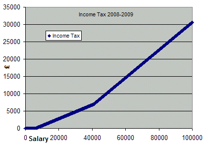
The first graph is showing how much income tax you pay depending on how much you earn. This graph is based on the standard un-adjusted tax free allowance of £6305, a 20% band for the next £34800 and 40% after that.
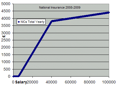
Next is a similar graph but for national insurance contribution. I’ve used £105 per week as being free from NICs, 11% for £105-£770 per week and 1% after that.
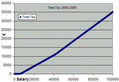
The third graph combines the total of the two to show the total taxation.
The final graph shows what percentage of your gross income you pay as tax. The interesting shape is caused by the National Insurance contributions changing to 1% before the 40% tax band kicks in.
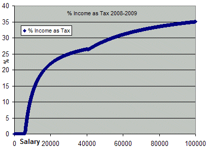
You may spot that when your salary reaches just over £40k the percentage of salary that you pay in tax actually goes down by a very small amount before going back up again.
many thanks. I was thinking of re-inventing the wheel. very useful
Nice set of Graphs. I have been researching and I am surprised the UK government does not present the tax and national insurance information in a graphical way. IT could also be good if you could create the 2009-2010 graph, and if you can also add a final graph of gross income vs net income.
Hi Daxx, I’ve now added the tax graphs for 2009-2010. You can find them here – https://www.reviewmylife.co.uk/blog/2010/06/10/2009-2010-uk-tax-graphs/
The 2010 – 2011 tax graphs are now available here – https://www.reviewmylife.co.uk/blog/2010/06/15/2010-2011-uk-tax-graphs/
Thanks for providing these graphs (and the later years).
I’ve been googling for precisely this for the past few hours until I finally found your site!
I’ve been trying to create a graph comparing income tax of the UK and Korea, but I’m working in the most mind numbing job at the moment, and I can’t for the life of me come up with an excel formula to produce a graph (Gross income v tax due). Perhaps you could provide your equation, please? :)