Straight after putting up the tax graphs for 2009-2010, I’m putting up the tax graphs for this tax year. This time the graphs are better, and some of them include a comparison line with the previous year’s figures.
As before I’ll state I’m not an accountant or tax expert so I can’t guarantee their accuracy, but I’ve done my best. The graphs assume that you are getting the default allowances. Let’s start with an overview of how much tax you’ll pay.
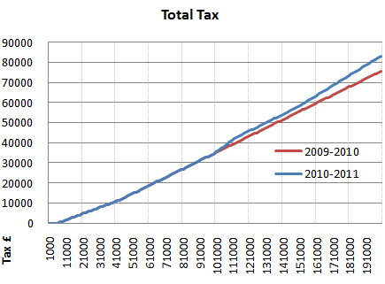
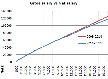
The big change for this year is the new higher 50% rate of tax, and the tapering off of your personal allowance once you reach the income limit. For most people this has no impact, it is only once you start getting over £100,000 that your tax will rise. You can clearly see the change in tax by comparing the red and blue lines in the graph.
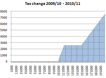
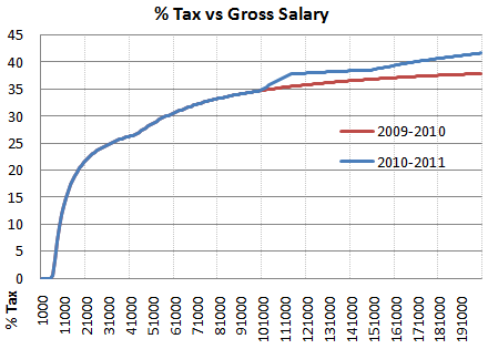
Next is a more visual way of seeing the tax changes. The first slope is where the personal allowance tapers off, and the next one is where the 50% tax band kicks in.
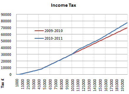
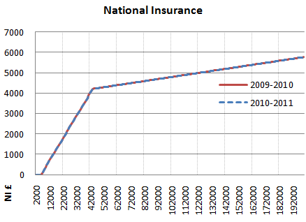
Income tax and national insurance
The overall tax you’ll pay is composed of income tax and national insurance. Here are two graphs showing how much of each one you’ll be paying.
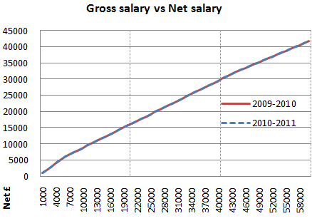
Gross salary vs net salary
Here is a graph showing your gross salary vs your net salary.
And a more zoomed in version which only goes up to £60,000.
Percentage of tax
And finally I have a graph showing the percentage of tax you pay against your gross salary. You can see that the new tax changes have made the shape more uneven (i.e. more complicated) than in the previous tax year. This is sure to be good news for accountants!
Updated graphs for the 2011-2012 and 2012-2013 tax years can be found by clicking on the link.