Google’s PageRank is a scale from 0-10 that shows how well connected web pages are. Web pages with higher PageRank values have more quality links pointing to them. It is not a linear scale, it is a logarithmic scale.
People estimates that the logarithm base is between 5 and 10. Because it is a logarithmic scale it can be quite hard to visualise.
I’m going to try to visualise PageRank with some graphs. In these graphs I’m making the assumption that the log base is 5. The first graph shows the values from 0-10 on a linear scale.
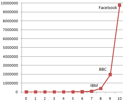
You can see that when the logarithmic scale is converted into a linear scale the difference between most of the lower numbers completely disappears. That is why these things are presented on logarithmic scales! I’ve added a few websites onto the scale so you can see where they are.
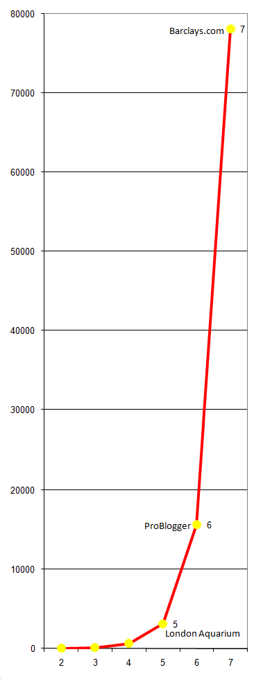
As most websites aren’t in the 7-10 range I’ve produced another graph showing just the values 2-7. I’ve made the graph very tall so you can see the difference between the values better. Again I’ve added a few websites onto the graph so you can see what kind of websites get the upper PageRank values.
The above two graphs are making the assumption that the base of our logarithm is 5. Would it make much of a difference if it was 10? Yes it would make a huge difference.
Here is a graph comparing what the PageRank linear values might be for a log base 10 graph vs a log base 5.
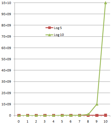
You can see that it is not practical to plot multiple logarithms on the same graph, so it would make a huge difference whether the logarithmic base was 5 or 10.
As for whether PageRank really matters – it probably counts for less than most people think. The toolbar PageRank of one of my sites recently went from 2, to 0, up to 3 and back down to 0 again. During these changes I noticed no change in traffic. The actual page contents and TrustRank probably counts for much more than PageRank on most web sites.
These graphs make it seem like PageRanks between 0-3 are pretty much the same, but in many niches, most of your competition will be in this range. If most of your competition is PageRank 3 and below, then there’s a huge difference between them!
It’s all relative, in the end, I guess.