I’ve been publishing UK tax graphs since the 2008-2009 tax year. It is easy to find tax information in the official government tables, but it is very hard to find simple graphs that show that the numbers mean in simple terms which is why I make these graphs. I missed out last years graphs so this year I will include the 2011-2012 and the 2012-2013 tax years. The 2010-2011 tax year is also included for comparison.
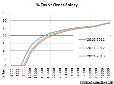
First of all here is an overview of the overall percentage of tax paid for salaries up to £200,000. The percentage for the 2011-2012 and 2012-2013 years jump mainly because of the national insurance rate increasing from 1% to 2% for earnings above the upper earnings limit.
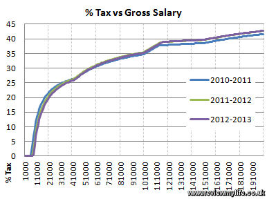
At the more average end of the salary scale the change between the years is more affected by the increase in the personal allowance.
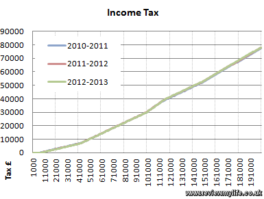
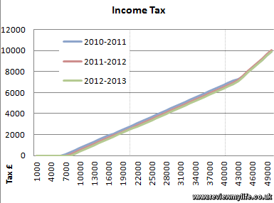
Here is a closer look at the income tax. It shows that the changes between these years have been fairly minor. There is always a lot of talk about tax changes in the budget, but in reality things don’t change much.
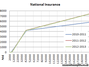
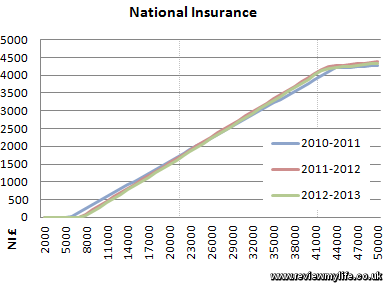
The national insurance graphs show a larger change for higher earners since the 2011-2012 tax year because of the 1% rate increase.
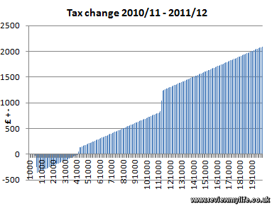
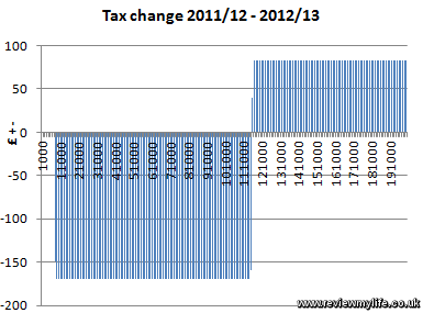
And finally two charts showing the absolute change in pounds paid as tax during these two tax years. These show that taxes for average earners have been decreasing, and taxes for higher earners have been increasing.
More next year…
I love the internet. No matter what I think about, someone has already done it for me. I was just thinking that I wanted to see the difference in tax take by salary, as a graph, compared with last year. And hey presto, here it is. Thanks fella.
It would be nice to see a graph with gross salary and net salary on the same chart. This way is easy to see how much you earn, you give to HMRC and how much you take home.
thanks!