If you want to know what the current value of your house, flat or property is (useful if you are buying, selling, or extending the leasehold for example) you can go for the easy option of asking an estate agent to do a valuation, or use a tool such as Nationwide’s house price calculator. Both have their disadvantages; the estate agent will almost certainly try to sell you an overly inflated figure to get your business, and an online tool such as the one from nationwide bases the prices on a very wide region (e.g. Greater London).
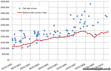
If you live in an area with lots of similar properties (e.g. a block of flats, or a street with very similar houses) and are good at Excel you can produce a localised graph of property prices over time. The scatter graph below is of the prices of flats for one specific street in London. The red line is the Nationwide regional data for flats in Greater London. Based on the sale prices of other similar properties you can make a guess as to the value of yours.
I’m going to assume you have a reasonable amount of Excel knowledge – this is *not* a step by step guide. To follow this you need to know how to import data into Excel, produce graphs, add new data to existing graphs, and format/sort data.
To start with you’ll need historical property sale prices. There are lots of websites that you can get them from, but www.houseprices.co.uk gives you them in a form that is easy to import into Excel.
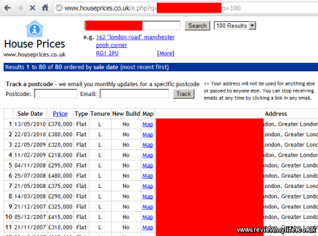
Try searching by postcode and by street name to get the relevant prices for your block of flats or street. I’d suggest setting the number of results to 100 so the data isn’t too broken up by their adverts.
Copy and paste the prices tables (there will be multiple tables split by ads) into your Excel sale prices spreadsheet one after the other.
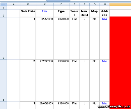
This produces a basic date vs price graph. If you select from the first date / house price to the last then Excel seems to correctly guess which way round the X and Y axis should be. If you include the column names in the selection Excel gets it wrong.
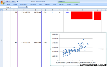
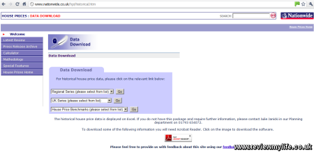
If you want to compare against regional data like I did, go to Nationwide’s house price data download page. I chose the ‘Regional Series’ / ‘Flats (Post 91)’ as the best match for the actual property price data I had.
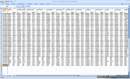
The Nationwide spreadsheet data looks like this with prices by quarter and region.
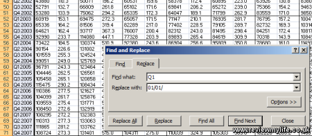
Unfortunately Excel doesn’t understand the date formats in this spreadsheet (e.g. Q2 2009) so I used Find and Replace to change the Q1/Q2/Q3/Q4 values into dates. E.g. I changed ‘Q1 ‘ into ‘01/01’. Note that I used the find and replace to remove the extra space.
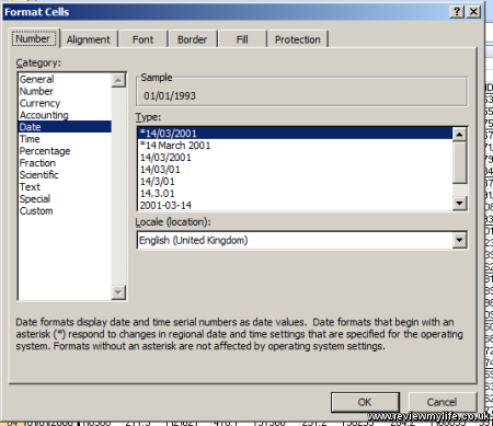
Then I marked the column data format as being in ‘date’ format.
I then copied the Nationwide data into a separate area of my original property sale prices spreadsheet. The data from the Nationwide spreadsheet is in chronological order, whereas the data from houseprices.co.uk is in reverse chronological order. I therefore sorted the Nationwide data to be in reverse chronological order as well so that it could be easily added to the same graph.
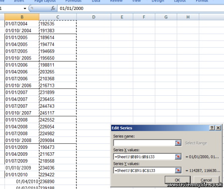
Finally I added a new data series to my original graph by selecting the Nationwide dates for the X axis and the prices for the Y axis.
And this is of course the result (I did a bit of tidying / formatting of the graph to make it look better), which will look familiar as being the graph at the start of this post.

It can’t predict the future, but you can make some useful assumptions based on past property prices. And it can give you a good indication if your estate agent is over inflating his/her estimate.